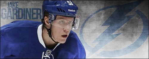
Giggy/Varlamov - 2nd Sig Attempt
Re: Giggy/Varlamov - 2nd Sig Attempt
I like that both of them are in it, and they look well positioned (as in size, clarity and focus are good for for players) however something need to happen in the background (?) or be the feature of the sig, as right now it feels to me (amateur hour please remember) like it's an over-cropped picture, just in that i cannot see much of either of them, top of heads, or more of their names (which i understand was intentional, 'VarlGuere'. It is likely very close to kicking ass
Re: Giggy/Varlamov - 2nd Sig Attempt
Well, for one... it's not really an art work per se, as it has no graphical/brushing editing involved much at all. They just look like the actual stock photo, cut and resized into a 500 x 200 pixel rectangle.
Try adding effects to the photo, maybe start with subtle patterns before making it into a piece of art.
Try adding effects to the photo, maybe start with subtle patterns before making it into a piece of art.
Re: Giggy/Varlamov - 2nd Sig Attempt
I agree but unfortunatley im not very good at this still.Nick wroteCOLONI like that both of them are in it, and they look well positioned (as in size, clarity and focus are good for for players) however something need to happen in the background (?) or be the feature of the sig, as right now it feels to me (amateur hour please remember) like it's an over-cropped picture, just in that i cannot see much of either of them, top of heads, or more of their names (which i understand was intentional, 'VarlGuere'. It is likely very close to kicking ass
got lucky with an image.
- Arian The Insider
- PostsCOLON 7304
- JoinedCOLON Mon May 03, 2010 7:05 pm
Re: Giggy/Varlamov - 2nd Sig Attempt
they look like homos
Re: Giggy/Varlamov - 2nd Sig Attempt
BrokeRocky Mountain.


